Sidebar filter to a Horizontal filter
This case study is focused on how we updated the sidebar product filter for products into a horizontal filter to make space for the (incoming) collection sidebar.
Overview
While the Sidedoor user base has been steadily growing, so have the features. To make space for new ones, we make changes to improve what had already been built.
In this case study, it will be broken down how we ended up transforming the sidebar product filter into a horizontal one.
Problems
- Considering the addition of the collection sidebar, it will cause the browsing space for the products to be narrow.
- The current sidebar product filter also takes quite a bit of user effort since it requires vertical scrolling when all filters are expanded.
- It's about time to add the specific filters currently selected to help users when navigating and filtering through products.
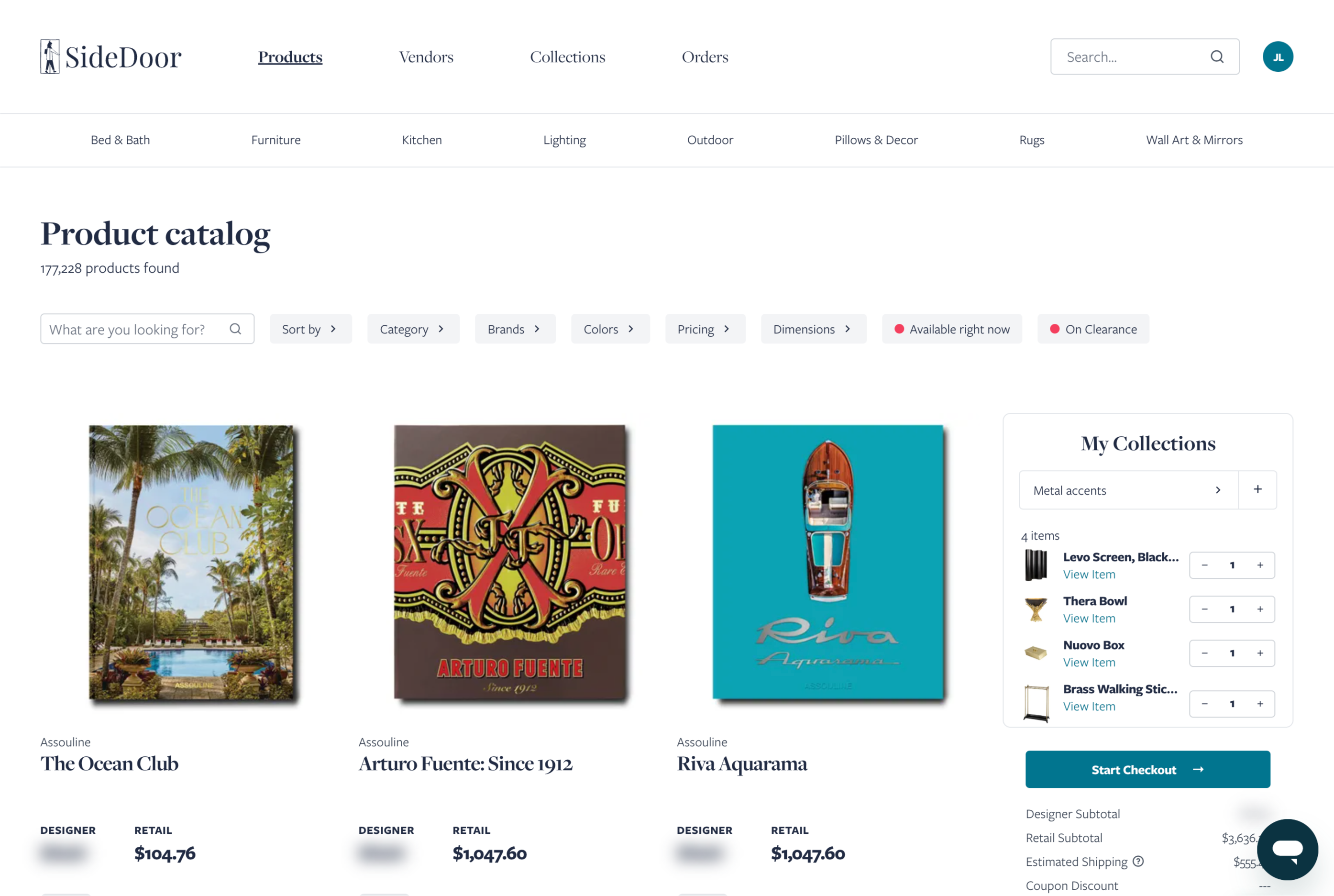
Proposed solution
Update the current sidebar product filter into a horizontal product filter. With this, labels will also be added for the currently selected filters.
Scoping the work
We are firm believers of “make it work first, then make it pretty later”. It was one of the bad habits I had before, and actually removing distractions (aka being bothered by things not looking nice) made me focus better on how to understand what I’m working on and how to handle it properly.
Usually we do sketches over a goodnotes page, or even directly “frankenstein-ing”/combining screenshots from our current work. To get a good look of how it will look like. And it’s usually faster than multiple passes of pure mockup designs.
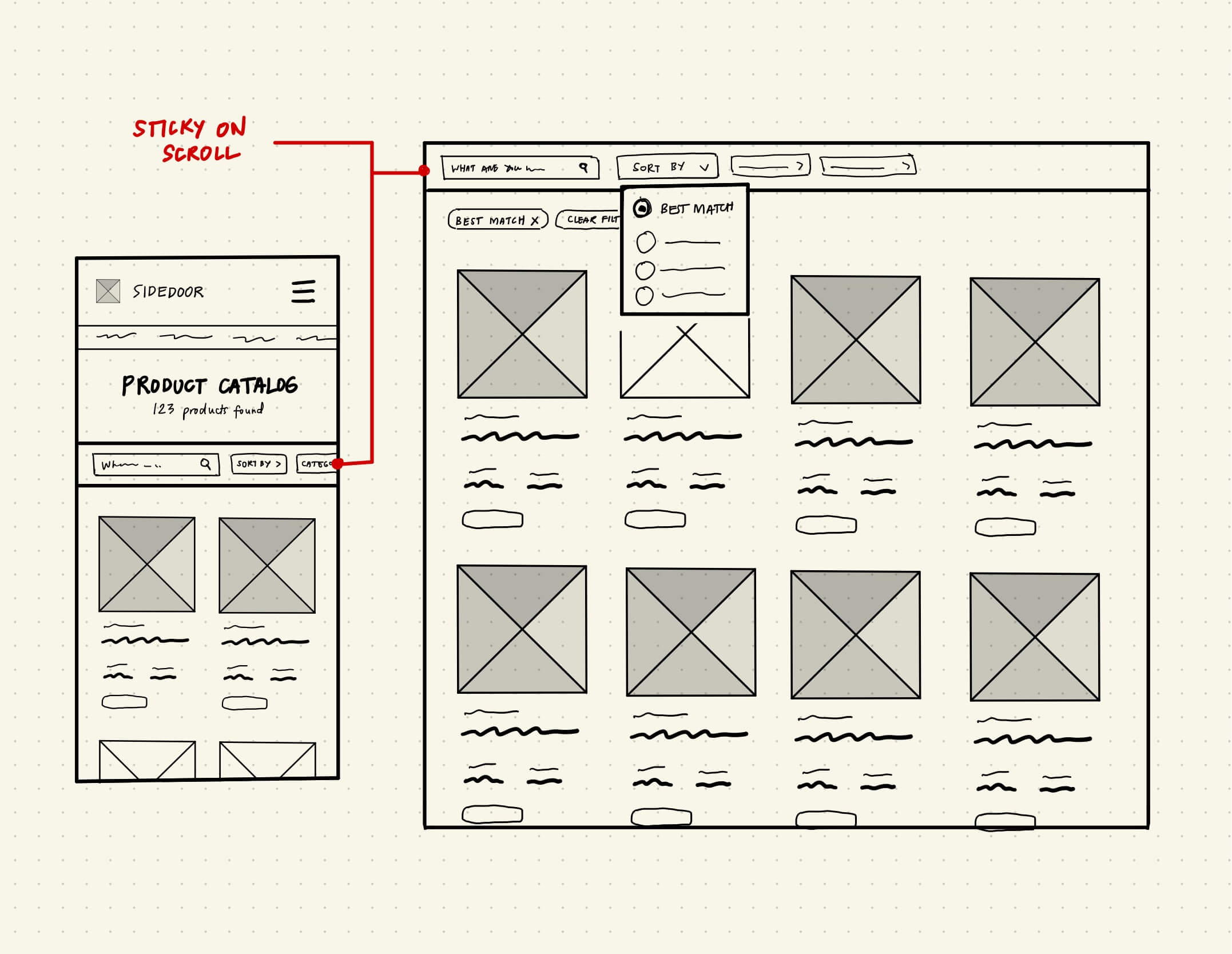
Further issues
If you'll notice, using the keyboard to tab from the "Sort by" filter jumps to the product name, instead of the next filter, which is the "Category". This is caused by the positioning of the dropdown menu and the header (which is sticky on scroll), which are both floating elements.
But, with the help of svelte-portal , we were able to fix things a bit easier!
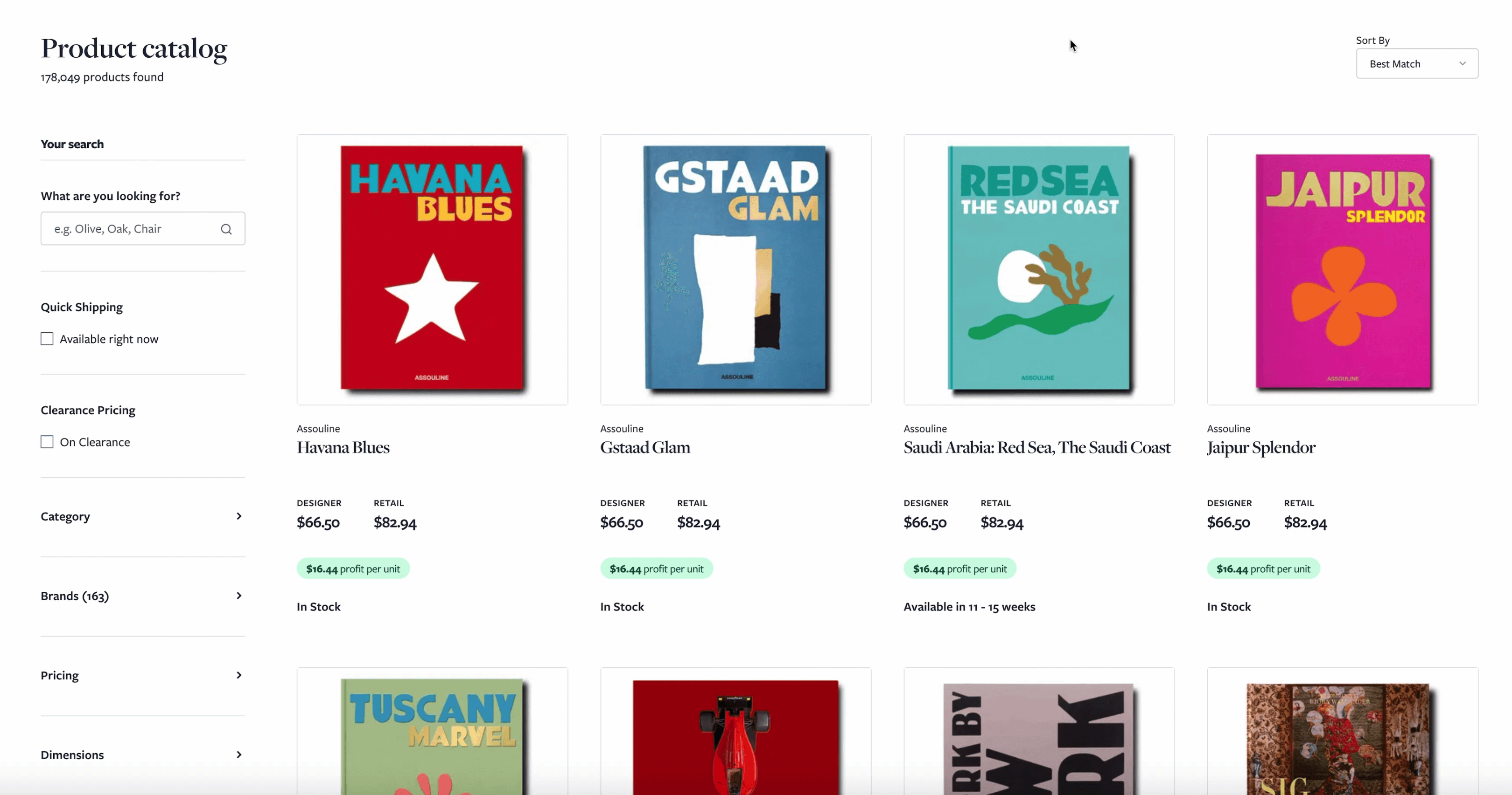
Voila!
An accessible sticky horizontal filter.