Angat Buhay website redesign
Angat Buhay is a non-government organization that inspires hope and bayanihan by harnessing the energies of partners, volunteers, and supporters to empower Filipino communities, especially the marginalized.

Overview
Angat Buhay is a foundation that aims to continue the anti-poverty and pandemic response programs started during Robredo's tenure as vice president, which all went under the same umbrella name of "Angat Buhay" (a Tagalog word meaning 'improve life's condition'; lit. 'Lift Life').
Disclaimer: This case study is entirely personal and has no direct bearing on the organization.
Problems
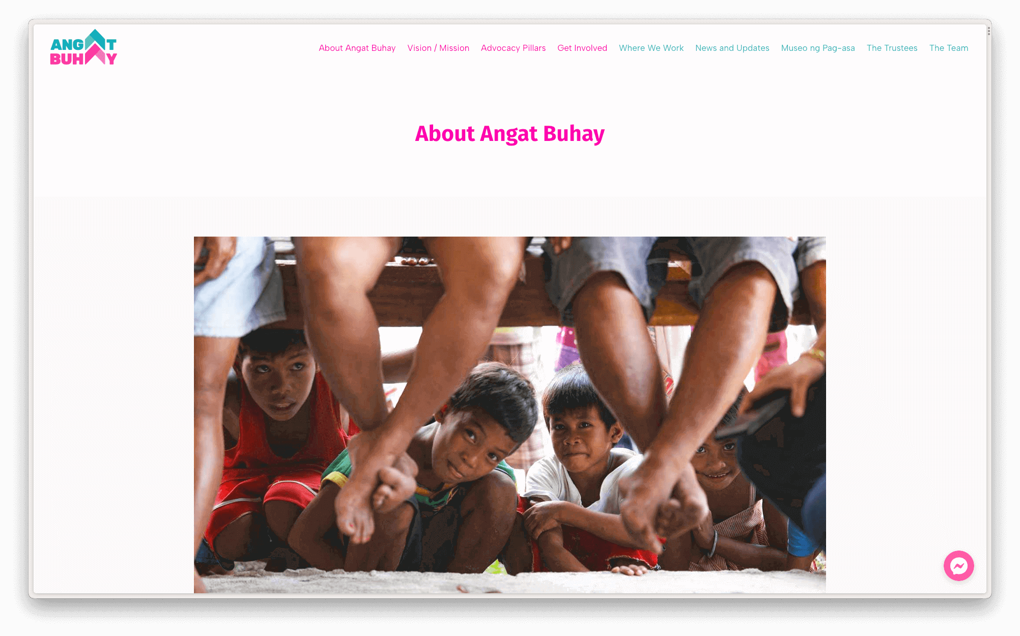
- The overall structure of the website is disorganized
- The pages on the current website are redundant, or the contents that should be grouped together are separated.
- Some pages contain minor content that seem irrelevant on their own.
- The navigation contains too many items
- The call-to-action lacks emphasis.

Proposed solutions
- Restructuring the sitemap to fit the purpose of the website better.
- Improving the UI while maintaining a branding similar to the what the current website is using (since I have no access to official branding)
- Add emphasis to call-to-action.
Sitemap
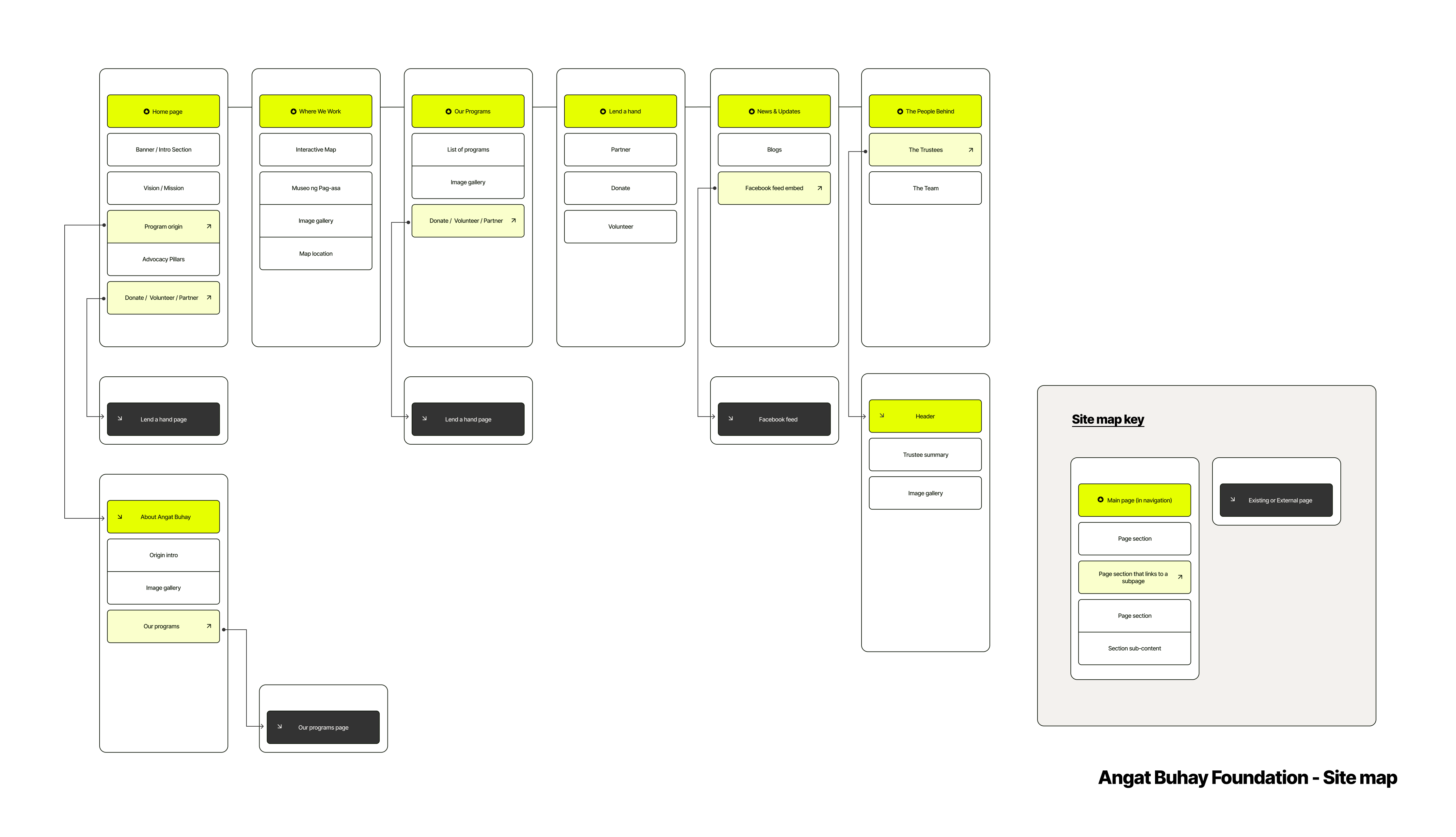
After doing a UX audit for the website, I created a sitemap that will serve as the website’s foundation. With this general overview, it’s easier to view the hierarchy and determine the unique pages that will be designed and built.

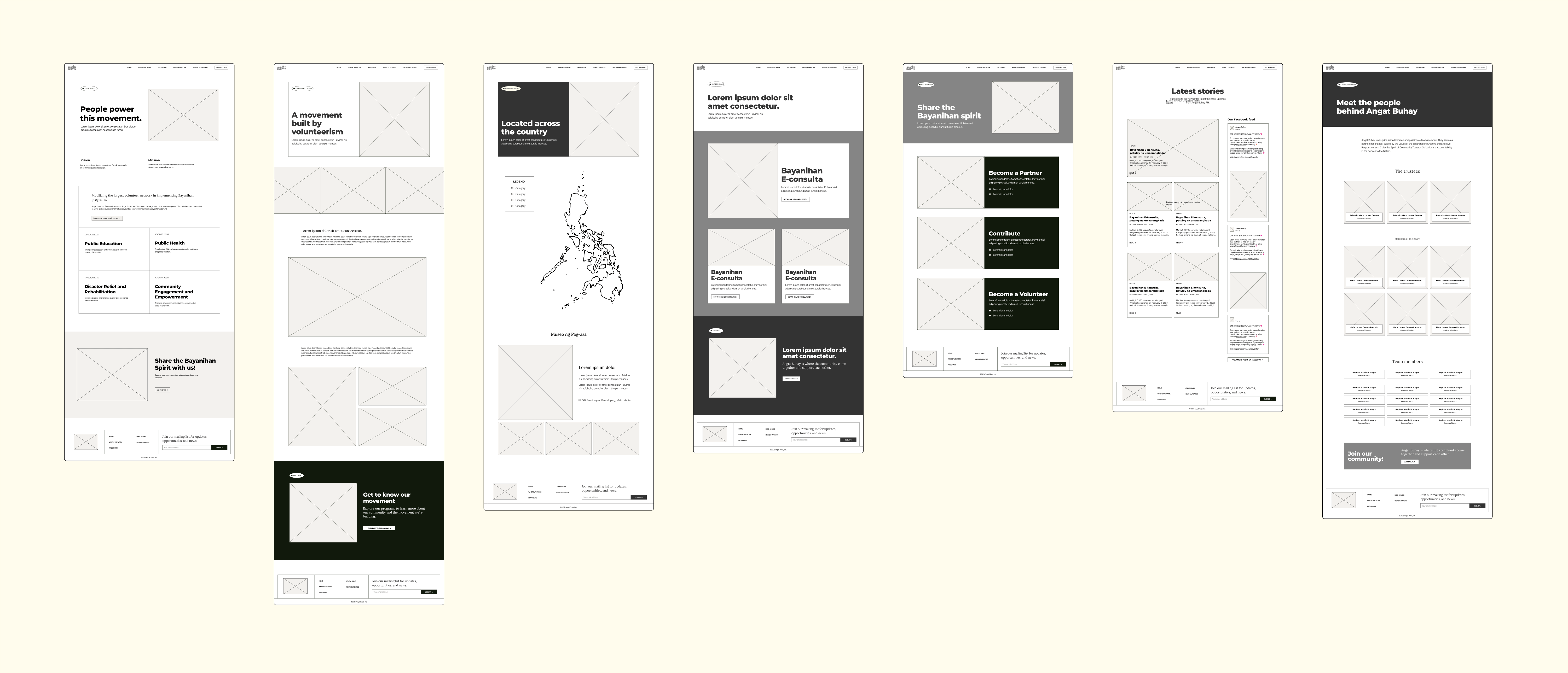
Wireframes

Website design
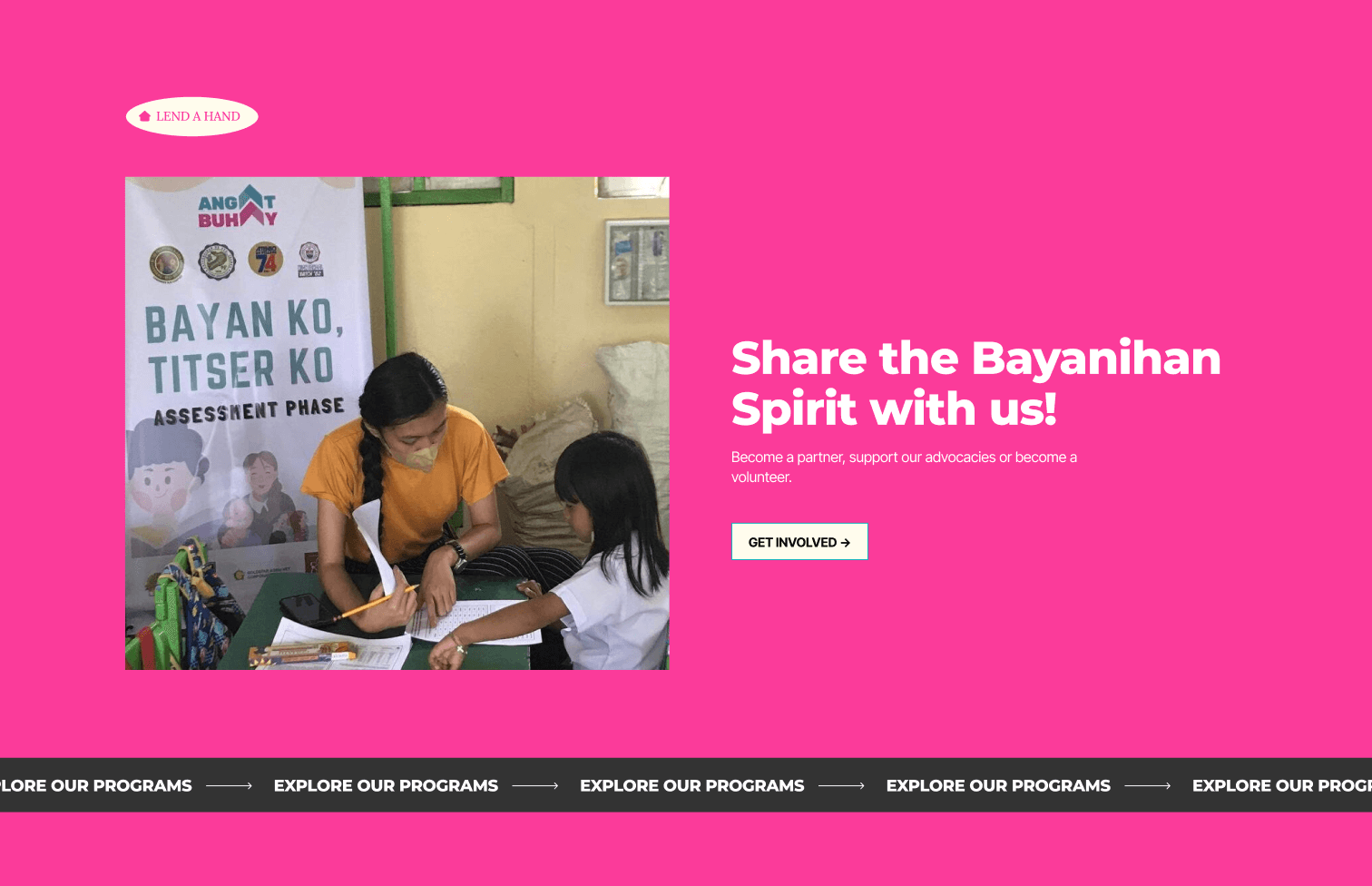
The website is simple and clean, matched with images that the organization has documented. The goal is to be concise, without losing it’s sincerity.
